Leysen website
Digital experience and luxe

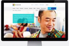
We were recently asked by Microsoft China to create a brand photo library that reflected the personality of the Chinese market and that would, in the process, help them tell brand stories.
The image bank had both to accommodate Microsoft’s aim of giving their products a simpler and easier “human interface” and also capture the real world we live in and make people the heroes. In every image, the aim was to tell an emotive story of people’s passions, realized through the use of its technology. The watchwords? Be warm, approachable, never cold or mechanical, clear, direct and honest.
The new Microsoft colour palette plays an important role in the composition, environment and styling. In fact everything has been designed to fit into the visual language of the brand thereby ensuring the imagery is immediately identified with Microsoft.
Emphasis was placed on composition, taking into account the final usage of the images (web) and ensuring the legibility of the images online.


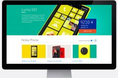
Using stylish design to improve sales and tell the story of Microsoft’s new product offerings, the site rethinks the user experience.
The latest technology was used to enhance the shopping experience, and more than 100 landing, category and product pages were organized and structured.
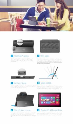
Storytelling and immersive design was used to establish an emotional connection with the consumer and display products in context along with video integration to give customers a great in-store experience online.
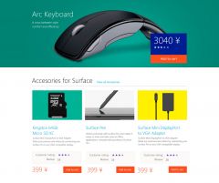
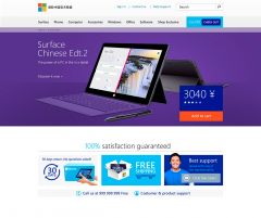
Smarter design standards were applied to ensure a consistent and rewarding experience. For example a consistent set of motions and animations were developed to provide the right context for usability and navigation, as well as extra dimension and depth, which improves the perceived performance of the whole interface, and drives engagement.