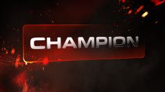
Champion
Champion Extreme Roads
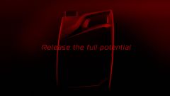
“Release the full potential”. This promise is interpreted and translated throughout the brand’s visual language, combining classical elements of a brand, like the logo, typography, and graphics as well as packaging photography and finally 360° communication.
More than a year’s worth of creative and art direction work were needed to put Champion lubricants on the map in print, online, and film. And there was also the development of a Champion 3D booth for the Automechanika Frankfurt fair. A solid start for the brand.
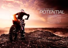
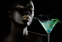
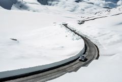
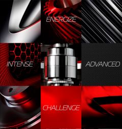
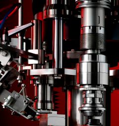
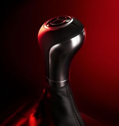
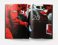
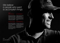
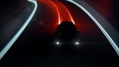
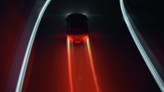
The visual and graphic language of Champion was combined to create a great expression of the brand values. The in-situation images dramatized the vehicles and the situations in a way as to evoke emotions, tension and strength. By using the same visual codes as in sports (moody atmosphere and sombre lighting) the images reinforced the human dimension and the personal challenge the Champion brand inspires.
In order to communicate the completely new, exciting and disruptive identity to its partners, Champion had to think big.
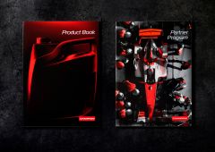
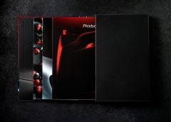
The brand book, normally just a list of rules to be followed, was totally rethought. The result is that Champion now has a real “Bible” for the brand, one that is both a guide to its strength and values while, at the same time, serving as a reference tool for its use and applications.
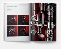
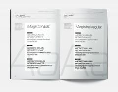
The concept of the brand bible – divided into 3 chapters – is to invite the reader into the world of Champion Lubricants through the art of storytelling. Apart from the classic graphic guidelines and range of product offerings, the book also serves as an invaluable inspiration on how to bring the visual language of the brand to life, and as an invitation tool to their partners.
THIS BRAND BOOK ALSO SERVES AS AN INVALUABLE INSPIRATION ON HOW TO BRING THE VISUAL LANGUAGE OF THE BRAND TO LIFE.
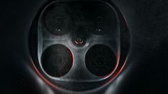
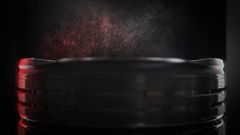
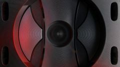
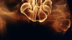
With the creation of a completely new brand identity, Champion lubricants also wanted to communicate its new brand positioning and values with a film. The film mixes live footage with CGI. All the sequences with liquids and flames were shot in slow motion with the Flex camera system.


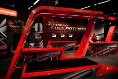
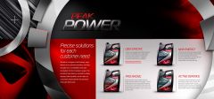
Automechanika is the largest after-market fair in the automotive sector. It was a unique opportunity for Champion to present its new visual and graphics branding with an impressive stand. Created using the colours of the brand (red and black), the stand showed off the newly branded products using photography and videos.