Leysen
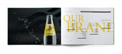
Brand image of Maison Leysen
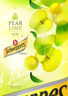
With these keywords defining the rebranding of this iconic soft drink, the task was how to reinforce the positioning of Schweppes as the leading premium adult soft drink in terms of consumer perception and preference?
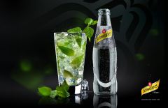
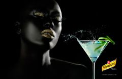
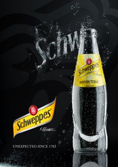
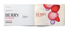
The questions posed by a rebranding were many. How do you associate the king of the evening cocktail mixers with a new range of fruit flavoured drinks to be consumed during the day?
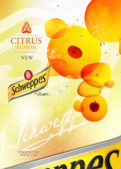
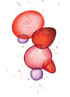
To answer this challenge, a visual and graphic identity was created bringing two worlds into one. The communication elements delve into the heart of the product and its history (Schweppes invented soda water), and the new, different and unique aspect:“Schweppervescence”.
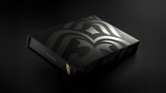
It was agreed that simple guidelines communicating the new identity across Europe wouldn’t do the rebranding justice. The brand book therefore had to reflect this new sophisticated image. The idea was to design a carefully crafted book that resembled a work of art.
There were 6 beautifully designed leaflets representing all aspects of the brand’s new visual identity packaged together in a folder with an embossed gloss varnished logo, The folder itself fits neatly into a high-quality box case.
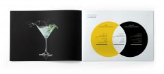
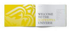
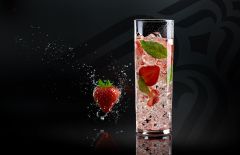
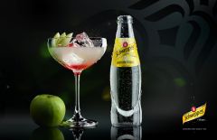
With a simple cocktail recipe, the viewer is transported into a world of surprise, capturing the essence and uniqueness of the brand – communicated with maximum emotion – while staying centred on the product.