
Leysen
Shaping the image of a luxury brand
Champion wanted to add a new layer of depth to their brand communication by reinforcing the original brand platform with a new product focused message.
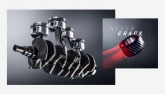
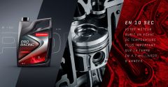
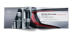
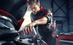
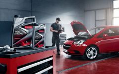
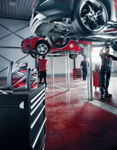
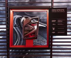
Technology advancements have allowed today’s engines to become smaller yet more powerful and efficient. This downsizing is a technical challenge, and as a consequence, having the right lubricant is more important than ever to ensuring theses engines deliver the high performance expected of them.
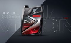
We build on the existing Champion branding, and integrate a new technical aspect: Champion Lubricants are especially formulated to deliver maximize engine performance in the most extreme conditions. We needed to change the customers view on the brand and make Champion lubricants represent concentrates of technology and innovation.

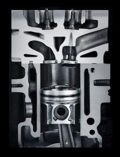
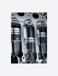
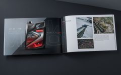
The combination and juxtaposition of these new images with the previous imagery of the “extreme roads” now delivers the full story the brand wants to communicate. There’s now a contrast with what’s happening outside vs. inside. The product is the bridge that allows the engine to perform beyond the ordinary.
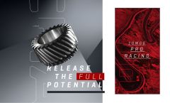
In parallel to the new photography, the graphic identity was also reviewed to deliver a style that was closer to the sharper innovation message.
The brand typography has therefore evolved, as has the colour palette. It includes new tones that give a more sophisticated look and feel and now evoke metal paint colours like the new blue grey pearl found on new cars.
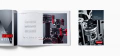
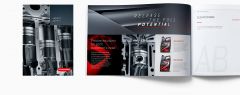
New graphic backgrounds were created for the layouts of all the POS and print materials.
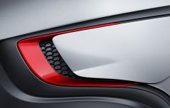
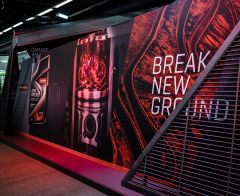
Not merely simple graphic images, they were made to evoke new car designs and prototypes using extreme close up of aerodynamic parts. All the visual expression of the brand platform has been condensed into these backgrounds.
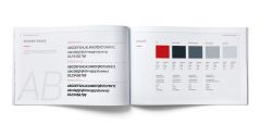
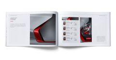
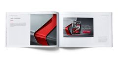
In order to align all partner and suppliers to this exciting new identity, we designed a new brand book. It was designed as a real brand bible and included a detailed overview of the brand’s strengths and values while at the same time serving as a reference tools for its use and applications.
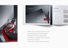
“We’ve seen that the coherence with which we have been building the Champion brand is paying off. Our brand is making more and more noise in the market. Today we are ready to take the next step on this journey, and become the leading brand in the aftermarket.”
Yves Decat, Champion Brand & Communication Manager.
For Champion the success of the brand includes creating a strong relationship with its distributor and garage network.
It means therefore that if Champion delivers a disruptive approach to their branding identity, they also need to approach the market in a different way by accompanying the products with parallel services.
We therefore created specific branded communication to communicate toward this target.
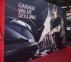
Both print and film executions were created for the garage owners to communicate the benefits of working with Champion. These elements were designed to show why Champion is the solution for their future, and emphasized the fact that they will get more customers, and more business by being part of the Champion branded family.
Champion wanted themselves to independent workshop owners as the right partner to help and support garages to become more professional, and face the future challenge of this market transformation. The movie set up a professional workshop owner who was facing some difficulties with his garage when a Champion SWAT team irrupts into his workshop to completely transform it : new branding, tools, training and communication. His garage will now be set up for a new beginning.
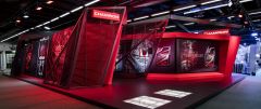
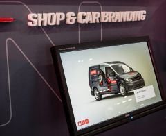
Conceived more like a real expo or retail shop rather than a traditional booth, the Champion stand at the big Automechanica trade fair in Frankfurt was totally disruptive and offered a surprise to the entire industry Visitors were invited to discover all the different facets of the brands, from the presentation of products through to the communication. Everything was choreographed to demonstrate the strength of the brands and their totally innovative approach to the sector. All aspects of the communication and visual language of the stand were designed to offer a full and consistent brand experience.
This most recent evolution in the communication and updated brand visual expression has been made to ensure that Champion is ready for the ambitious objectives they have set themselves over the next 5 years.